Color
 Source: Brewer C., Harrower M., The Pennsylvania State University. Color Brewer 2.0
Color underpins the visual design and conveys a story. The use of color should be meticulous and associate with the range of chosen indicators in a given dataset (i.e. sequential, divergent, qualitative). The cohesive design of a color palette helps to map a range of indicators to a corresponding hue, value, and saturation.
Base Map Theme
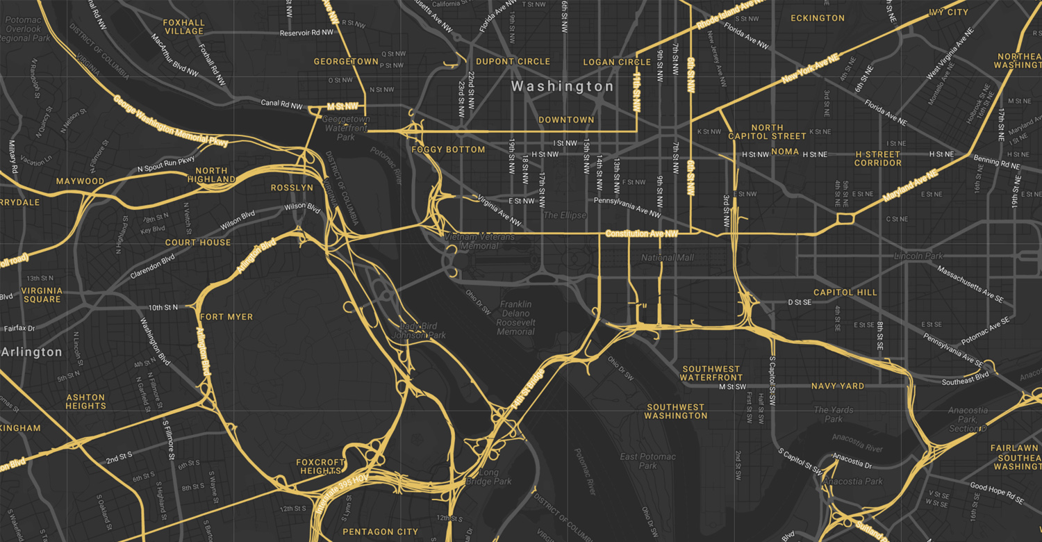
 Source: Mapbox (Rasagy Sharma). Moonlight
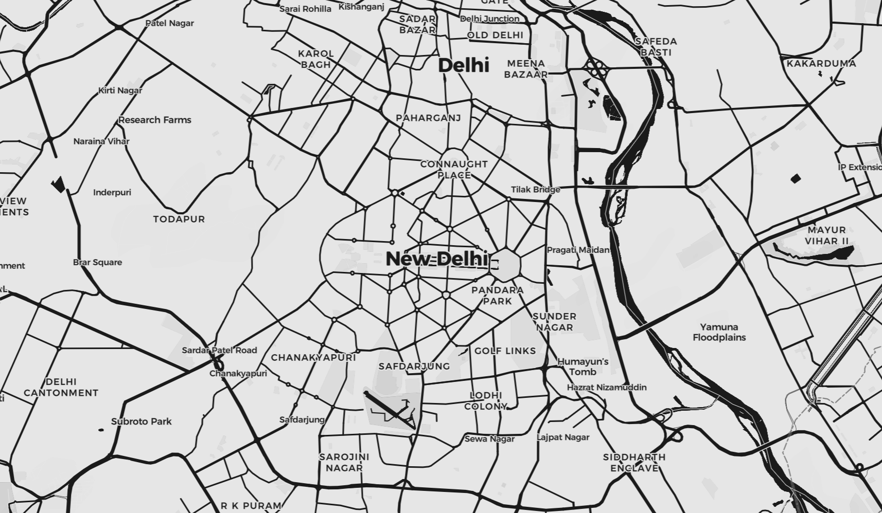
 Source: Snazzy Maps (Becomeadinosaur). Light Map
 Source: Snazzy Maps (Damian Szymaniak). Multi Brand Network.
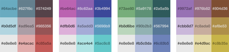
Color Schemes
 Color Palette Source: Color Brewer 2.0
Different types of data require different color schemes. Use sequential colors for sequential data, diverging colors if the data is divergent, and qualitative colors for categorical data. Try Color Brewer 2.0 for convenient lookup for common color palettes, and generate color schemes for your data set.
Bivariate Color Scheme
In this article, Joshua Stevens describes how to build a choropleth map to visualize two parameters in one map.
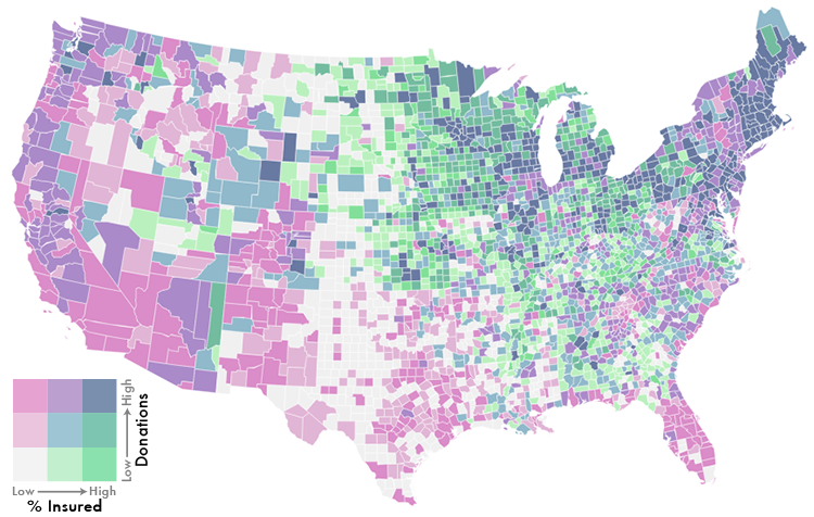
Examples of bivariate color schemes. Source: Joshua Stevens. Make a Bivariate Choropleth Map
Accessibility
Use accessible color palettes make elements distinguishable.
Classification
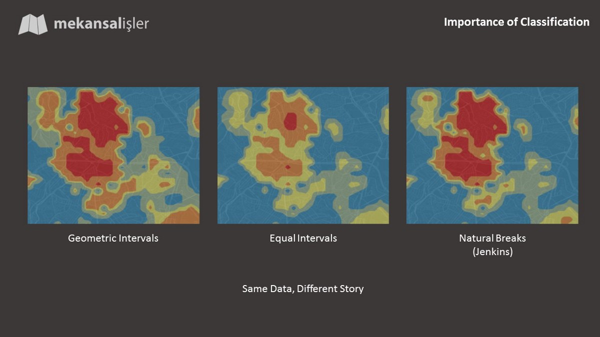 Source: Anil Celik. Color Methods and Mistakes in Spatial Data Visualization
Additional References
Agile (Matt Hall). No more rainbows! https://agilescientific.com/blog/2017/12/14/no-more-rainbows
Snazzy Maps. A live editor and archive for map styles. https://snazzymaps.com/
Mapbox. Custom map styles by Mapbox designers. https://www.mapbox.com/designer-maps/
Medium (Anil Celik). Colors, Methods and Mistakes in Spatial Data Visualization. https://medium.com/@acelik/colors-methods-and-mistakes-in-spatial-data-visualization-60d02e7f09fd