Typography
 It's a good place to start with one comprehensive font family that can provide multiple styles and weights for building a consistent theme. We are using IBM Plex as a versatile open source alternative to the Helvetica standard.
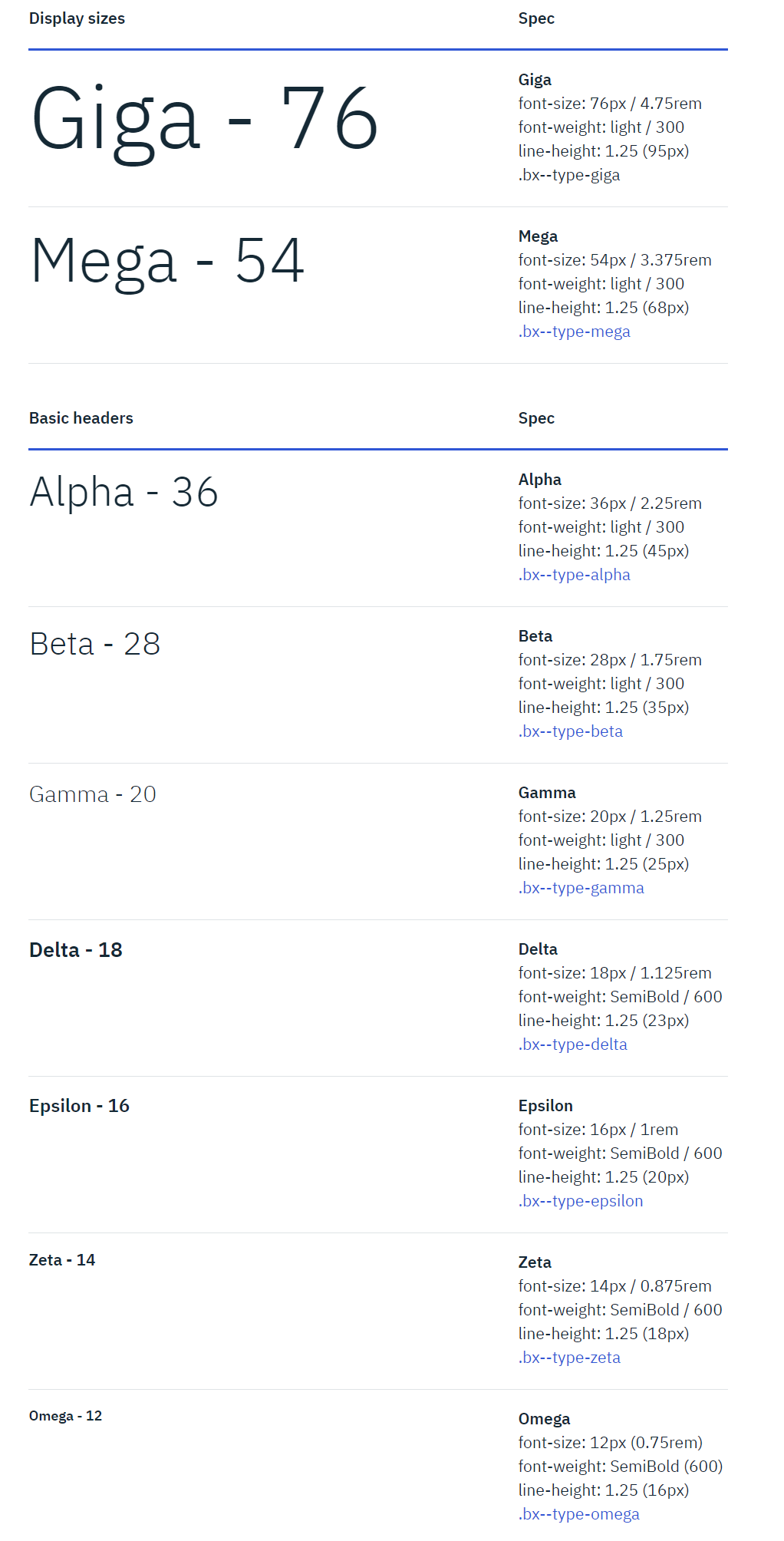 Image: IBM Plex Type Styles
Styles - Serif, Sans and Mono
The key difference is that Serif typefaces have decorative character stroke terminations. Depending upon the visualization complexity of your map, Sans style may work well for labels on the map. Mono typefaces have same width characters. The glyphs line up in neat, regular columns, making it easier to read.
Size & Weight
The combination of size and weight establishes the spatial hierarchy of the written elements.
Color & Stroke
Additional References
Donny Truong. Professional Web Typography. https://prowebtype.com
Typewolf. What's Trending in Type. https://www.typewolf.com
Wiki.GIS. Typography. http://wiki.gis.com/wiki/index.php/Typography